Code
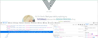 In the CSS they had 5 different media queries making changes as the screen size changed. The logo changed sizes accordingly. The developer used multiple layers of images to create a complex navigation menu.
User Interface - UI
 I found it was easy and fun to navigate because of the graphics. I also enjoyed the navigation bar and the graphics that were attached to the links. Visually, everything is streamlined and kept clean. No fat border or overwhelming graphics.
User Experience - UX
 The user interface on this website is epic! While the design is simple, the pops of color help make it fun and visually appealing. The colors makes the experience enjoyable.
Summary
In conclusion, I was pleased with the user experience. The layout and graphics where stunning. It was easy to navigate the pages listed within the website. Veerle is an inspirational designer and I am happy that she has a website that provides a way for others to learn basic graphic techniques.