Code
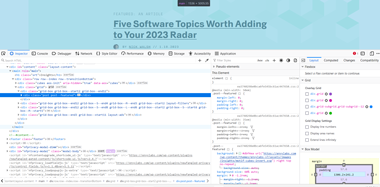 In general, I have a very difficult time understanding all the information that is displayed in the inspect element. There is a mixture of JavaScript and html. They use a lot of grids overlay which I was unable to follow. Numerous id tags were used instead of class. The website did not validate.
User Interface - UI
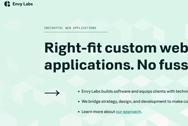 Overall, the customer experience was good. The background graphics are visually appealing and help with drawing users to certain areas on the page. However, the main page does not meet the A11Y standards. The site was user friendly and easy to navigate despite the text being hard to read in some cases. I don’t think the site could be developed much simpler. It is almost boring. The company logo could also use some updating. It was good to see that there wasn’t a lot of “flashy” graphics, as the website is presenting the company as being very professional.
User Experience - UX
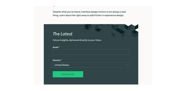 The navigation menu at the top of the screen does not scroll with the page. The small crystal shape that shows up when you hover over the navigation bar needs to be bigger, more visible. There are many opportunities to submit an email address to either subscribe or contact the company. The website does a good job providing links to other platforms created by Envy labs to simplify coding which is useful. I don’t understand why you would have a Careers section when there are not job openings.
Summary
In conclusion, the experience was pleasant. Providing an easy-to-understand learning environment if you have no experience with web design. I feel that this will help the company reach many different types of audiences and support developers at different levels. The only problem that I see with this website is the background color is to light and needs to be changed to a darker tone. Making sure A11Y specifications are met would be an easy fix.